Learners analyse a range of related graphic design work created for media products:

a) Purpose:
The purpose of this Graphic Design work is to be put up on billboards and on social media sites to sell, advertise and promote this upcoming album and to promote the artist Kanye West.
b) Format:
This work is a poster used to be stuck on buildings and advertising boards. These posters were printed as A2 and A3.
c) Content:
This poster includes the album artwork, date of release and information about how to purchase it.
d) Style:
The poster follows a very plain style, it is mostly black and white, the only other colour coming from the album cover itself. The text links very well to the picture because of the hand made look of the cover, the text on the poster also looks hand drawn. They have used plain colours like black and white to get the attention from their intended audience, the black is mostly used so that it appeals to people older than 15 years old, this album is not for kids and by the design of the cover it makes sure that kids aren't going to be attracted towards it because it is not brightly coloured or very graphical and interesting, instead it follows a plain hipster style to meet the target of teenagers and young adults.
The title of the album is at the very top of the poster because thats what catches the attention, also the name of the artist is right below that so the audience can get an idea of who the album is from. The release date is right at the bottom of the poster which is effective because it leads the poster off with a high note, the people that have read the poster will now be even more excited because they've learned the date.
f ) Target audience:
The target audience for this poster is mainly Kanye West fans which tends to be people within the age of 15 - 25, both male and female. I guess everyone sees the posters but not necessarily be interested in it. Fans of Kanye West and music in general would be attracted to this poster because of the content, obviously his name but also the ominous cd cover that doesn’t really show off too much, building interest and excitement.
g) Regulatory bodies
The FTC (Federal Trade Commission) controls the advertisement in America whether thats for Advertisement & Marketing, Credit & Finance, Privacy & Security etc. They are the people that control if the advertisement is usable or not, or if any changes need to be made so that it is appropriate for public use.
The ASA is in charge of authorising printed advertisement, the public can write to the ASA informing them about an advertisement that isn't appropriate. There isn't anything on this poster that can be complained about to the ASA. In the advertisements for this album there isn't anything inappropriate on this poster or any other advertisement for 'Yeezus', if there was it would be noticed and taken down by the ASA because it wouldn't appeal to the intended target audience, there isn't any violence or inappropriate language within the advert so it can be seen by all audiences and not offend anyone.

a) Purpose:
The purpose of this film poster is to promote and advertise the film 'The Dark Knight', it is used to inform the audience when the film is coming out and to give a small look at whats to come.
b) Format:
This film poster was used outside of cinemas and sold as merchandise. It wouldn't have only been outside a cinema but would have been plastered around other buildings and advertisement boards, in a A2/A3 sizing plan.
c) Content:
This poster features a picture of Batman looking prepared, it also includes the names of the actors in the film, the production companies involved and a release date. The poster also features a tag line at the top of the poster, to give the poster some eeriness.
d) Style:
The poster sticks to the theme of Batman very well, dark themes and colours. Even the fonts used are very bold and stick out well. The emotion that this poster gives off is quite dark and scary/uncomfortable in some ways, the dark colours and ominous character create a dark emotion for the poster, creating an expectation that the film will follow similar emotion.
e) Layout:
The layout of the poster is quite simplistic, with the popping orange/red fire attracting the audience to the poster the most, the rest of the poster is easy to read, bold text beneath and above the main image. The names of the actors above the title of the movie, this allows the audience to get an idea of who is in the film before they even know the title.
f) Target audience:
The target audience for this, as far as the poster is concerned, is most likely fans of the actors and the Batman franchise. For this franchise specifically, because it's a lot darker than most Batman media related posters, there would be an older target audience, within 16 - 30.
g) Regulatory bodies:
The BBFC is the regulatory body that controls the ratings of films in the UK, they rated The Dark Knight as a 12 but noted that the film contains "fantasy violence and sustained threat", which contributed to its rating.
The ASA may have had an issue with the depiction of a building on fire as a form of attack, but as seen on the poster, it was cleared anyway, these things that are on the posters could have caused an issue because ASA might have these things as inappropriate for the public viewing, even if the film is targeted at 16 - 30 year olds, the public will still see the advertisement and could see an issue.
The ASA may have had an issue with the depiction of a building on fire as a form of attack, but as seen on the poster, it was cleared anyway, these things that are on the posters could have caused an issue because ASA might have these things as inappropriate for the public viewing, even if the film is targeted at 16 - 30 year olds, the public will still see the advertisement and could see an issue.

'It's Always Sunny in Philadelphia' Season 11 Poster:
a) Purpose:
The purpose of this is to promote and advertise the newest season of 'It's Always Sunny in Philadelphia', it's also used to let people know when it is coming out.
b) Format:
This advertisement poster is most likely stuck up outside buildings at used a media conventions in a A3/A2 sizing format.
c) Content:
This poster is very simple, it features a picture of the characters in the show, the title, the release date and some company logo/information.
d) Style:
This poster has a grey/yellow theme, the language covers the title of the show and the picture relates to the text with the colour theme and relation of characters, this style used on the poster portrays quite a creepy emotion, with the black and white colour scheme generally creating that feel.
e) Layout:
The layout of this poster is very simple, the title and picture being the main focus of the poster, seeing as they are the largest things on the poster and the most centred things. The other information on the poster is at the bottom at either corner.
f) Target Audience:
The target audience for this poster is fans of the previous seasons of the show and fans of the actors in the show, the target audience age range is most likely from 16 - 30, either male or female, because there isn’t any gender specific content shown on the poster.
g) Regulatory bodies:
The FFC controls the ratings and what is acceptable on TV in America. They pass what is safe for TV channels and set the watermark for certain channels.
The ASA control the advertisement that is pushed to the public, this poster would have been assessed by the ASA for checks of any inappropriate language or material. If there was any inappropriate language or material on the poster, it would have to be taken down or re-assessed by the ASA for public viewing again.

The ASA control the advertisement that is pushed to the public, this poster would have been assessed by the ASA for checks of any inappropriate language or material. If there was any inappropriate language or material on the poster, it would have to be taken down or re-assessed by the ASA for public viewing again.
LO2 - P2/M1/D1
Be able to generate conceptual ideas for related graphic design items:
P2)
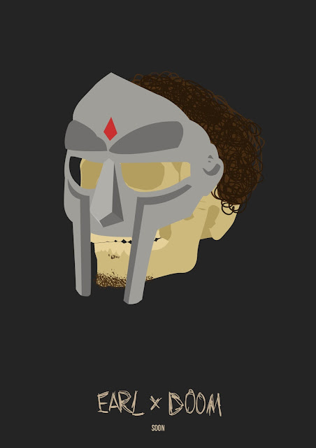
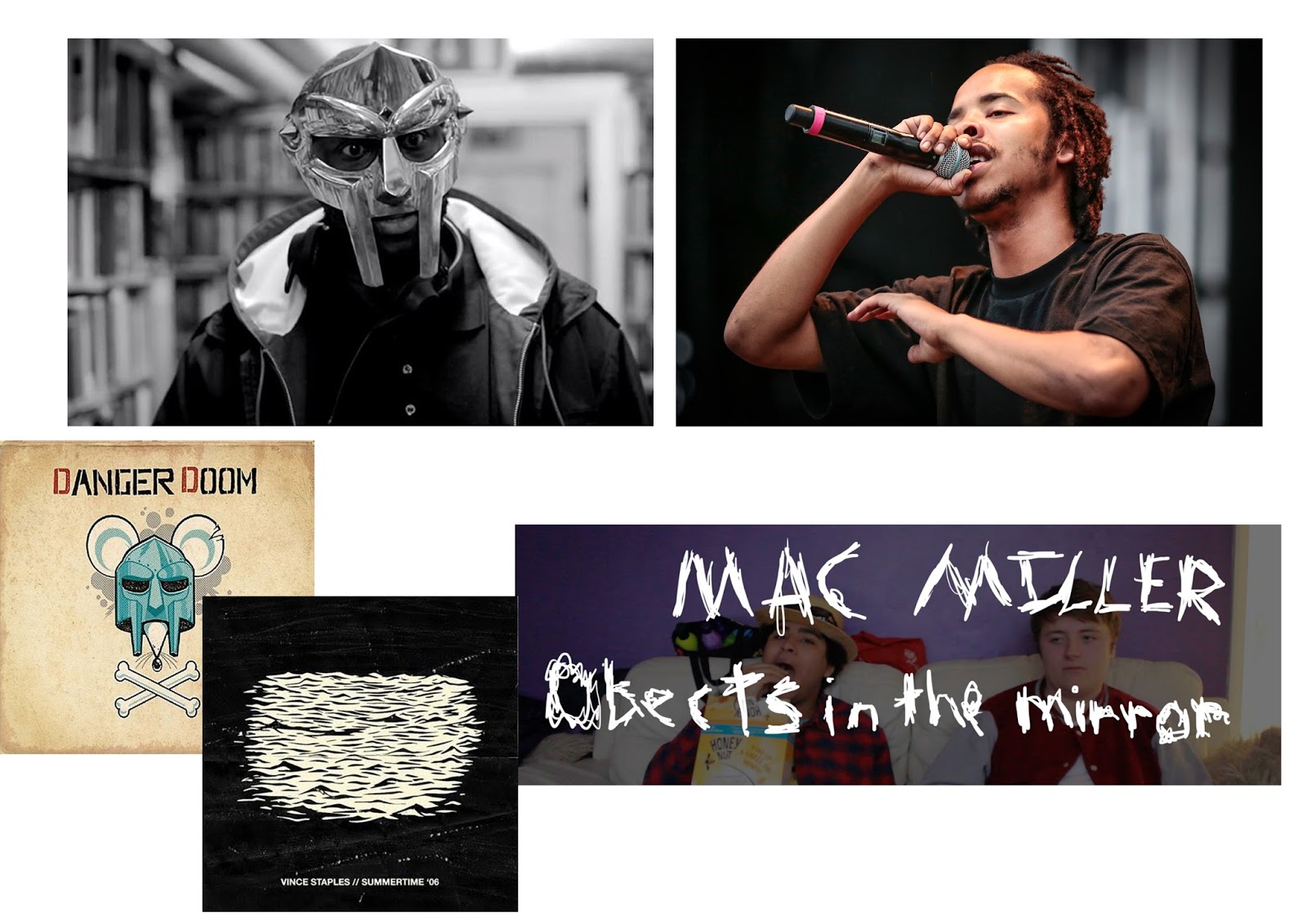
Idea 1 - Earl Sweatshirt/MF DOOM Collaboration album:
Album cover - I am thinking of create an album cover that only features a picture of Earl Sweatshirt wearing the DOOM mask, with maybe a title along the bottom.
Tour Poster - I want to create an 'old timey' styled poster that is themed with bright colours, it will feature both artists and a couple of people that could be featured artists.
Album Poster - I want the album poster to be similar to the album cover, it will have the picture of Earl wearing the DOOM mask and instead of having the album name, it will have the release date on it.


Idea 2 - JayZ Documentary advertisement:
Film Poster - I want to create a film poster for a documentary about JayZ called 'Public Service Announcement' (Doesn't exist). I want it to feature of JayZ on stage preforming in front of a crowd that isn't there, it will feature the release date and title.
DVD Cover - The DVD cover will be very similar to the poster, but it will feature a crowd. It will have the title and some information about who is commentating on the documentary.
Online Promotion - Again, this online promotion will be similar to the poster, with the same picture and title, but will have a space next to it with some information about where to buy/stream the documentary.
Idea 3 - Quinn film:
Film poster - I want to create a poster that features the two main characters back to back surrounded by a bunch of other stuff and characters that are in the film, with the release date of the film and a tag line.
DVD Cover - Similar to the film poster but with the title instead of the release date.
Bus advertisement - I want the bus advertisement to consist of the two characters back to back again, with a white background. It will have the title, release date and website url.
How these ideas are appropriate to the needs of the target audience:
Idea 1 - Earl Sweatshirt/MF DOOM Collaboration album:
I believe that these three designs would appeal to their intended target audiences, between the ages of 18-30 predominately male, because these are the products that the audience would want to see. Anyone that is a fan of both artists would see each of these designs and get more and more excited every time. They might see the Album poster first and get excited that the two are working together, then the album cover and come to the realisation that it’s actually happening and finally the tour poster would cement the excitement for the audience. I think it's necessary for each of these designs to be released because they are the things that the fans will actually care about.
Idea 2 - JayZ Documentary advertisement:
These designs ideas would fit the target audience because they show off the fan loyalty to JayZ. JayZ's target audience are people that listened to him in the 90s and early 2000s, and people that want to watch a documentary about hip hop, and my designs cater to this criteria.
Idea 3 - Quinn film:
The intended target audience of the Quinn Film was people within the ages of 15-21, the designs would appeal to them and be appropriate for them because the designs aren't too harsh or leave the genre, they stay true to the idea of film.
Be able to present conceptual ideas for related graphic design items to a target audience:


Presentation
Feedback:


LO4 - P4
Be able to plan for the production of related graphic design items:
Budget
My original graphic design idea would cost quite a lot to advertise because it is not very well known. I will need a reliable website where we can use the design of posters and get them made and delivered to us. The posters will be going on bus stops and billboards around quite a lot of cities in the UK which will be paid for through the budget. I will need to buy CD cases and print the Covers to build.
Some of the things I need to spend my budget on are as follows:
£240 - 1 Year subscription of Adobe Illustrator or Adobe Photoshop.
£2,040 - I am going to need an experienced graphic designer and will require him to work 3 days a week 10am - 3pm for roughly 2 months. £73 a day £15 an hour.
£1,151.67 For all the posters: Link to website
- £393.69 - 300 A3 Posters (Inc VAT & Delivery)

- For 50 CD cases on Amazon it costs £14.03, I will most likely need a lot more than that. So for example if I need 1000 cases, it would cost me £280.60.
Production schedule:

Legal and Ethical
The ASA control the advertisement that is released in the UK, the guidelines that they set concern if an advertisement is relevant and appropriate. I will need to make sure that there isn't anything offensive on the posters, I will also need to make sure that the posters give the correct information and aren't completely irrelevant to the product.
I also need to make sure that in the designs, I need to use completely original assets, if I don't then I could come into the issue of the original owner not allowing me to release the posters and CD Cover. Where as, if I design original assets I won't face this issue.
LO5 - P5/M3/D2
Be able to produce related graphic design items:
ALBUM POSTER:

CD COVER:

TOUR POSTER:

No comments:
Post a Comment